Concentric Time
 Try it out!
[Source code]
Why I made this
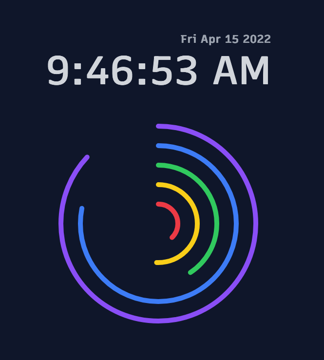
I have 3 young children who have lots of wonderful questions about how the world works. I thought of this project as a way to showcase progress-to-completion of various time intervals (1 hour versus one minute, etc).
Whether this is groundbreaking to their brain development or not, it was fun to build, is nice to look at, and is one small way I can put a smile on someone’s face.
How it works
This was created using Dioxus (a RustWasm framework) and Tailwind CSS.
All of the logic fits into one ~250 line file, with simple components and reactivity.
Dioxus’ rsx macro looks pretty elegant and allows me to use regular Rust syntax for values and props, like so:
cx.render(rsx! {
    div {
        class: "p-4 w-full h-full flex flex-col justify-center items-center sm:gap-y-12 dark:bg-slate-900",

        TimeDisplay { time: current_time.get().clone() }

        div {
            class: "grid grid-cols-1 grid-rows-1 place-items-center scale-75 sm:scale-100",
            Ring { label: "Minute".into(), percent: percentages.4, radius: 220.0, color: RingColor::Violet }
            Ring { label: "Hour".into(),   percent: percentages.3, radius: 180.0, color: RingColor::Blue }
            Ring { label: "Day".into(),    percent: percentages.2, radius: 140.0, color: RingColor::Green }
            Ring { label: "Month".into(),  percent: percentages.1, radius: 100.0, color: RingColor::Yellow }
            Ring { label: "Year".into(),   percent: percentages.0, radius: 60.0,  color: RingColor::Red }
        }

        Appropriation {}
    }
})
You may notice that the color is specified as an enum variant. That is then translated into the proper colors using methods that return the TailwindCSS classes:
#[derive(PartialEq, Clone)]
enum RingColor {
    Gray,
    Red,
    Yellow,
    Green,
    Blue,
    Violet,
}
impl Default for RingColor {
    fn default() -> Self {
        RingColor::Gray
    }
}
impl RingColor {
    fn as_stroke(&self) -> String {
        match self {
            RingColor::Gray => String::from("stroke-gray-500 dark:stroke-gray-400"),
            RingColor::Red => String::from("stroke-red-500"),
            RingColor::Yellow => String::from("stroke-yellow-400"),
            RingColor::Green => String::from("stroke-green-500"),
            RingColor::Blue => String::from("stroke-blue-500"),
            RingColor::Violet => String::from("stroke-violet-600 dark:stroke-violet-500"),
        }
    }

    fn as_fill(&self) -> String {
        match self {
            RingColor::Gray => String::from("fill-gray-500 dark:fill-gray-400"),
            RingColor::Red => String::from("fill-red-500"),
            RingColor::Yellow => String::from("fill-yellow-400"),
            RingColor::Green => String::from("fill-green-500"),
            RingColor::Blue => String::from("fill-blue-500"),
            RingColor::Violet => String::from("fill-violet-600 dark:fill-violet-500"),
        }
    }
}
Then the values are accessed like so:
#[inline_props]
fn Ring(
    cx: Scope,
    label: Option<String>,
    percent: f32,
    radius: f32,
    color: Option<RingColor>,
    stroke: Option<f32>,
    class: Option<String>,
) -> Element {
    let label = label.clone().unwrap_or_default();
    let stroke = stroke.unwrap_or(10.0);
    let color = color.clone().unwrap_or_default();
    let stroke_color = color.as_stroke();
    let fill_color = color.as_fill();
    // ...
}
The SVG rendering was quite tricky to figure out, but was a fun part of this project. If you inspect the code for the Ring component you’ll see that we render:
- a circle with a calculated circumference and offset based on the percentage (this is based on the clock)
- create a path definition in preparation for the label using math to make the right arc
- inject the label text and base it on the arc from before
Try it out yourself, in light or dark mode!